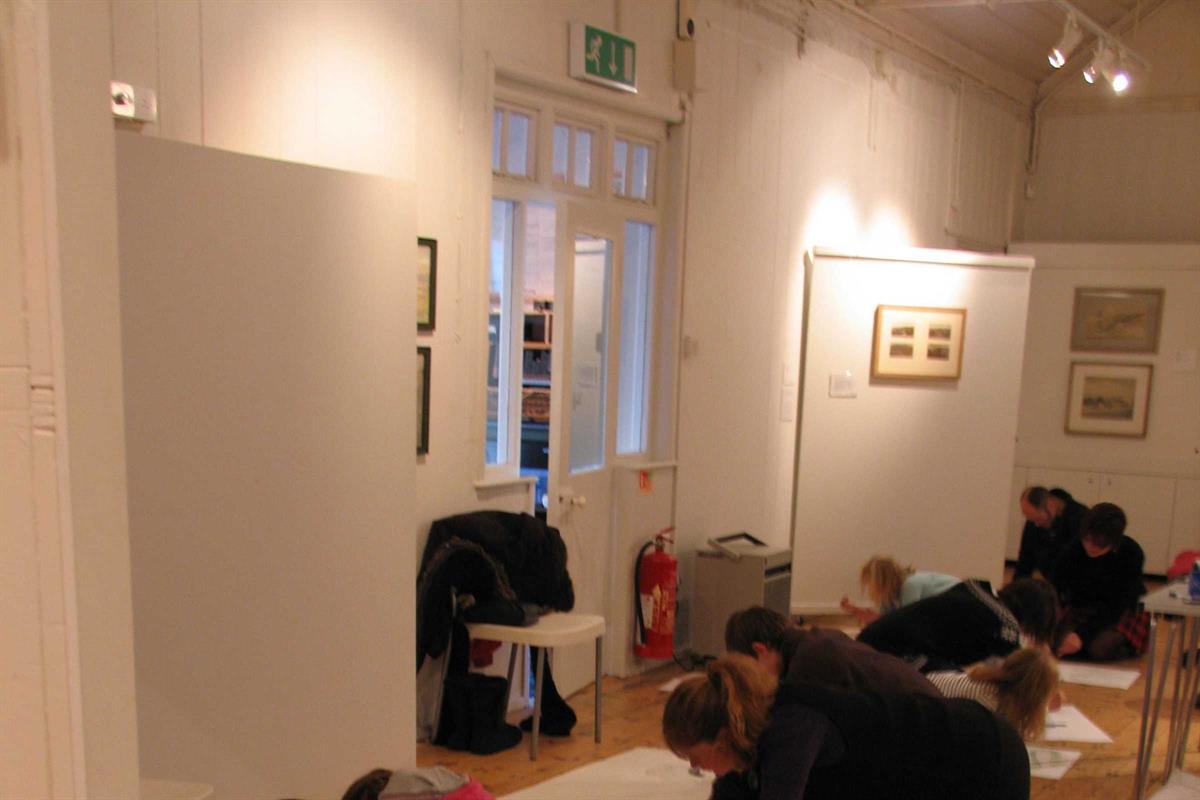
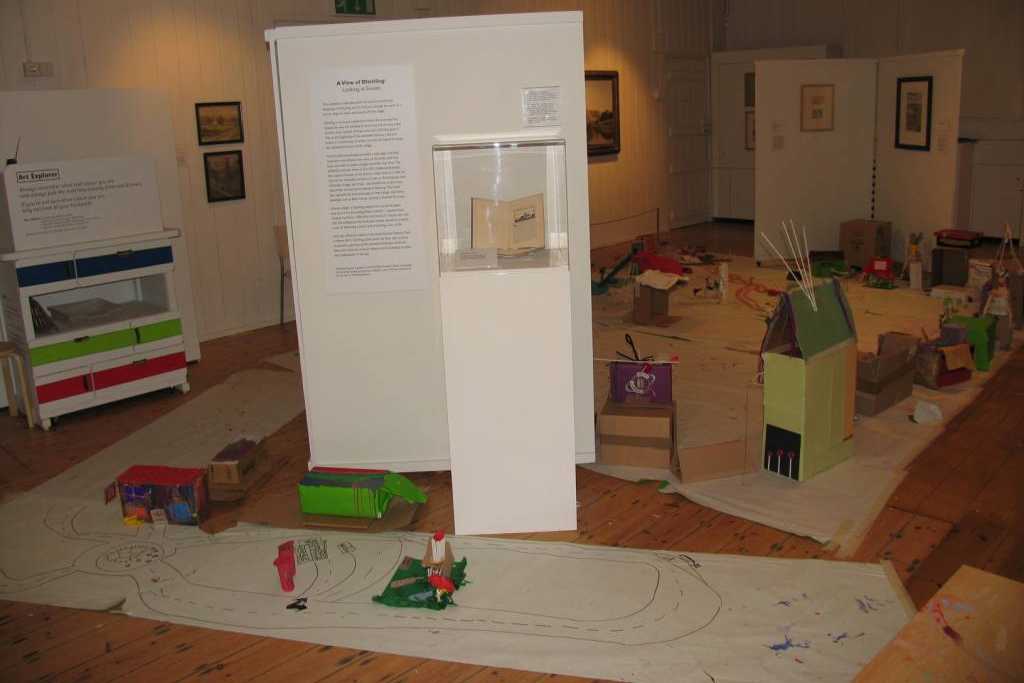
Ditchling Museum of Art + Craft was transformed in a major redevelopment. New buildings were cleverly designed to fit in-between old, linking a complicated series of buildings from different eras over a multi-level site.
Summary Information
| Size |
45m2 |
| Cost |
£150,000 |
| Type of build |
Renovation |
| Location |
East Sussex |
| Project timescale |
April 2012 to April 2013 |
| Architect |
Adam Richards Architects |
Introduction
Ditchling Museum of Art + Craft was transformed in a major redevelopment. New buildings were cleverly designed to fit in-between old, linking a complicated series of buildings from different eras over a multi-level site.
The original Museum buildings – a Victorian school and headmaster’s cottage – have been modernised and now house the main gallery, a small temporary gallery, a print gallery, the parlour and reading room. The new buildings house a collection store, an introduction space and a link building with an accessible lift. The site has also expanded into old buildings; an 18th-century Grade II listed Cart Lodge that has been reinvigorated and now houses the new entrance, shop and café.
The Clore Learning Space (CLS) was originally a Victorian classroom and was later converted into a cottage which adjoined the Museum but was not part of it. During the CLS redevelopment all interior walls of the cottage were dismantled and a false ceiling was removed, exposing the roof joists which were replaced and left exposed to increase the height of the space. The roof was entirely stripped and retiled. The floor was reinforced and replaced, windows were replaced by double glass doors which open out onto the garden.
The CLS can be closed off securely from the rest of the Museum or opened up to the galleries as required. It is fully accessible with disabled toilet facilities within it.
Challenge
Before the creation of the Clore Learning Space workshops had to take place in the main galleries or external sites had to be hired at a cost. When the gallery was used for events this had to be before or after the Museum was open or on the one day of the week the Museum was closed. Objects were moved repeatedly to accommodate workshops and the number of people who could engage with the programme was severely restricted, as was the variety of workshops and events that could be run at the Museum.
Redevelopment took place as the Museum buildings were in a dreadful state which was hindering activities, negatively affecting visitor numbers as people were put off by the state of disrepair. Access was very poor, and collection development was not possible without extra and appropriate storage.
Planning
Prior to the development the Museum initiated a review of its offer. An informal and formal action learning programme was developed which demonstrated the audience demand and types of activities a learning space would need to accommodate.
We wanted to create a practical but also aesthetically pleasing and inviting space that would function for children and adults and formal and informal groups. A room where younger audiences didn't feel constrained in a 'school environment'; one that adults didn't feel they were in a childlike environment, but also a space that when needed, could function on a more formal level.
The CLS also needed to accommodate up to 45 people for lectures in a comfortable environment with the ability to block out light, have accessible power points, and room for a screen to be seen clearly.
Management and maintenance
The space itself is low maintenance. The floor is a black, hardy vinyl and the walls are plain. Sturdy, well-designed, high-quality tables and chairs were invested in, and have performed well with no breakages so far: they still look smart, and in good condition.
The Learning and Outreach Manager’s office is situated directly next to the CLS which makes managing the space and the activities run in it easier than if the office was housed in another part of the Museum. As previously mentioned, learning events are prioritised when timetabling the space, but this can be at the cost of other Museum activities. The minimalist interior and white walls of the CLS are a stark contrast to the chaotic traditional ‘art space’. The simplicity of the space encourages users to keep it clean and tidy.
The external access to the space is extremely useful but does pose a security risk. Staff and volunteers need to be mindful of leaving exterior doors unlocked or open if rooms are not being used. The Museum alarm system incorporates the entire museum which means it is not possible to isolate the CLS when it is in use outside Museum opening hours. It would be useful to alarm the space separately: this would open up more opportunities for external evening hire of the space, increasing revenue at a time when the space is not being used for our core learning activities.
Lessons
Storage
The room’s limited storage space was taken up by plant for the building, resulting in any bulky equipment not being able to be stored in the CLS. The outcome of this is that equipment is stored in other parts of the Museum or in outhouses which have not been refurbished and are damp and without sufficient storage structures. It is inconvenient and time-consuming to move equipment around the Museum, often when we are open.
Hire
The Museum is small, therefore space it as a premium and as the CLS is one of the largest flexible spaces in the Museum, making it a busy room which has many demands on it. It not only hosts our thriving learning programme but is also a very useful and valued space to other members of staff who use it for meetings; a work space for volunteers; workshops; laying out new exhibitions; and a space to host group visits, as well as external hires.
We try hard not to let these demands impact on the learning programme but occasionally there have been clashes. Another smaller flexible space would be extremely useful – or if the CLS was larger – a partition which would enable the space to be used for more than one event at a time.
Displays
One of the original aims was that the CLS would be a temporary exhibition space for showcasing learning projects. Two rows of movable spotlights on tracks were installed in the room for this purpose. However, using the walls to hang work was not preferable due to the number of radiators on each wall, and the permanence and cost of hanging framed work on fixed walls. Instead temporary display boards were used, which were cleverly suspended from the roof beams, creating a gallery feel and extra wall space effectively displaying work in a temporary way. At times this has worked, but as the space is in such high demand having the display boards in situ is not practical, neither is displaying 3D work.
Unframed work can easily be attached to the walls and the space can still be used when a temporary exhibition like this is up. Fortunately the Museum’s Curator and Director are supportive of using the Museum’s main galleries to showcase learning projects; this means that work on display is given more prominence, which delights workshop participants, and clearly shows the importance that the Museum places on learning to all our visitors.
What would you change?
An awning to shade the large patio doors would help to prevent the overheating which can be uncomfortable when the room is used by a large group of people. The awning would also provide useful shelter outside, increasing the opportunities to use the outside space.
The door connecting the learning space to the rest of the Museum is wooden. Our visitors would enjoy and benefit from being able to see the CLS and we are looking into replacing the original door with a glass one. This will enable our visitors to see the space and the activity that goes on inside, and it is hoped will potentially boost more workshop bookings as well as external hires.
There are too many radiators on each wall which restricts the amount of wall space we can use for hanging work.
The black floor shows up dusty footprints easily – a dark shade of grey may have been more forgiving.
You can never have enough storage; it would be good to have more but the space doesn’t allow it.
What makes your learning space really effective?
- Light, spacious and airy space – people enjoy being in the space.
- The room is clutter free with clear surfaces and walls, and equipment is stored out of view in closed cupboards. This makes it a blank canvas and therefore an adaptable and versatile space. It is used it for a variety of events: from messy early years’ sessions, to school workshops for classes of 30, to evening lectures and Museum hires such as parties, away-days and formal dinners.
- A separate entrance is useful for external hires, for workshops where Museum entrance is not included and is convenient for deliveries. There is an outdoor area attached which in effect doubles the size of the room. This is invaluable especially during children's workshops as it allows the children opportunity to stretch their legs, play and eat their lunch.
- There are kitchen and toilet facilities and the space is accessible which increases the use of the space.
- Its prominence and proximity to the main galleries helps to clearly show that learning is integral to the Museum.
Gallery
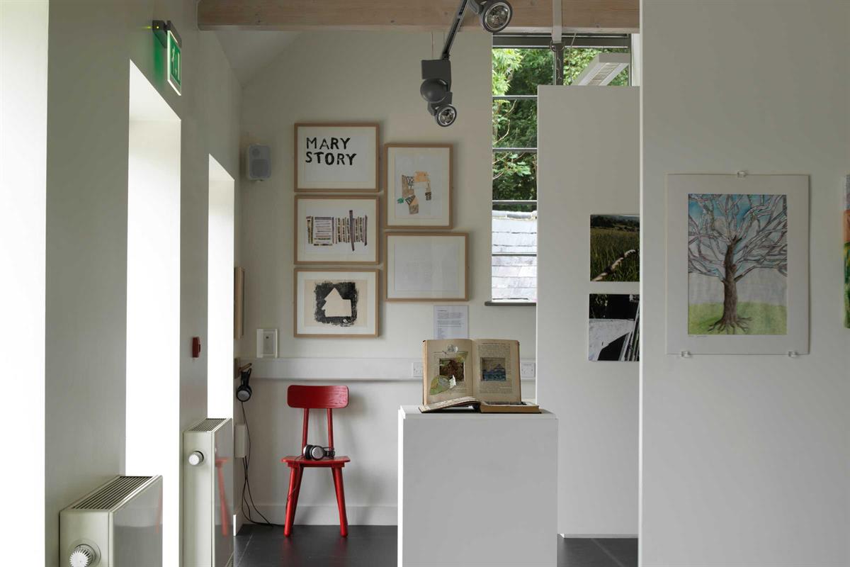
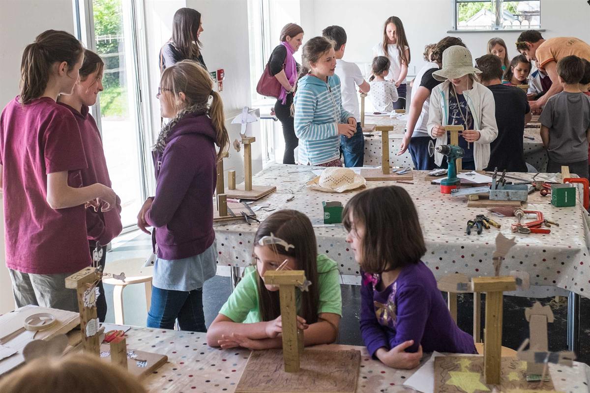
The Clore Learning Space set up for an exhibition with temporary walls. Photo credit_ Brotherton and Lock
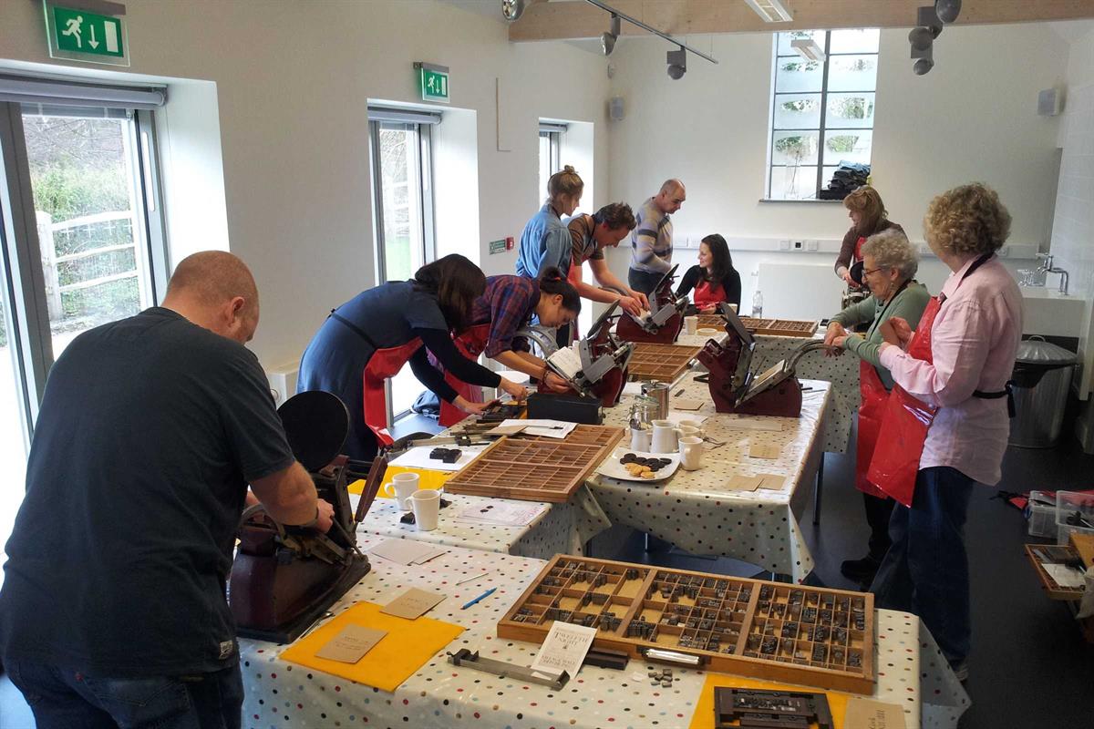
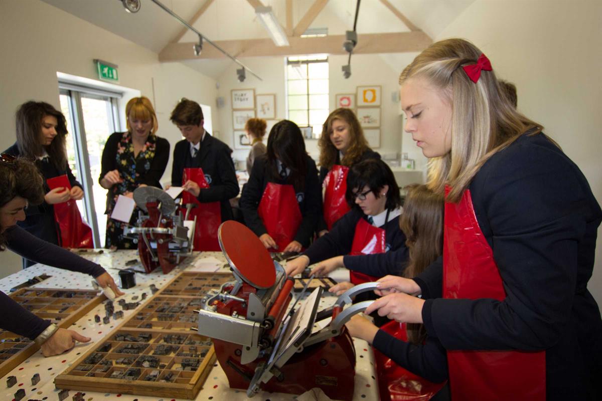
Love Letterpress workshop
